EXAMINE: Behind the Design of the New Vancouver Christmas Market Logo
PROJECT + PRIORITIES
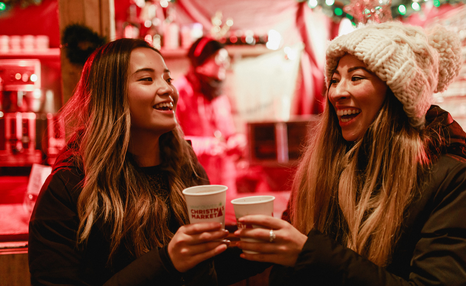
Vancouver Christmas Market is a treasured holiday tradition for locals and visitors alike. Having recently moved to an expansive new seaside site at Jack Poole Plaza, their 8th annual festivities marked the perfect time for an updated logo and fresh brand.
The task at hand was not to design something entirely new, but to revitalize the existing logo to ensure that the scale and prominence of this Vancouver staple were fully represented.

CHALLENGES + CONSIDERATIONS
As the Vancouver Christmas Market grew, the logo needed to be implemented in more situations, in a wider variety of layouts and at all sizes. The relationship of the icon and wordmark in the logo made this difficult in many cases. One of our primary goals was to integrate the elements more seamlessly into something that was extremely versatile and legible in all cases.
Knowing that this event is a cherished yearly tradition for many, with some attending every season since the market’s inception, we sought to maintain a sense of familiarity. A central challenge was making a bold enough transformation to attract attention, without losing well-earned brand awareness or risking the misconception that any beloved elements of the market would be changing.
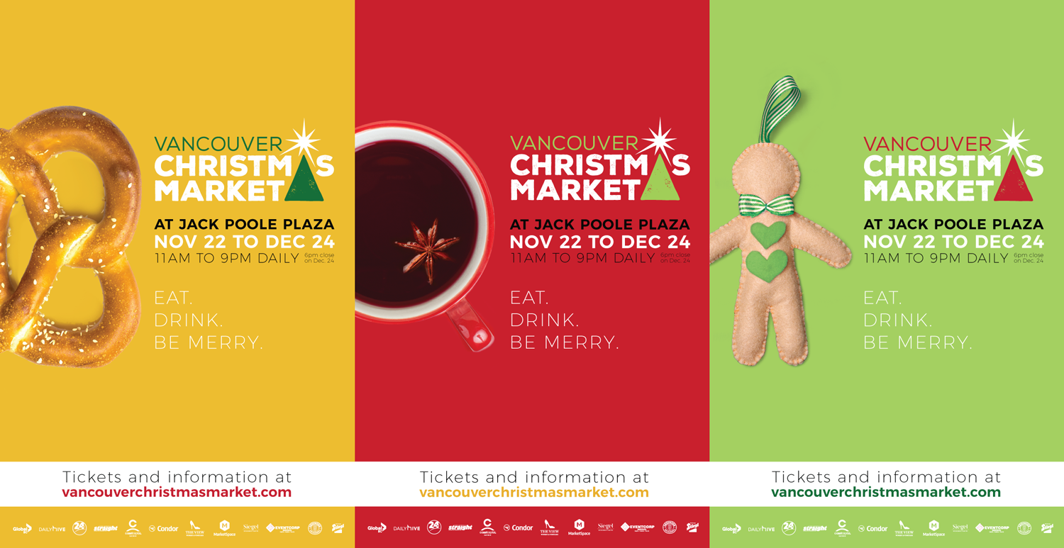
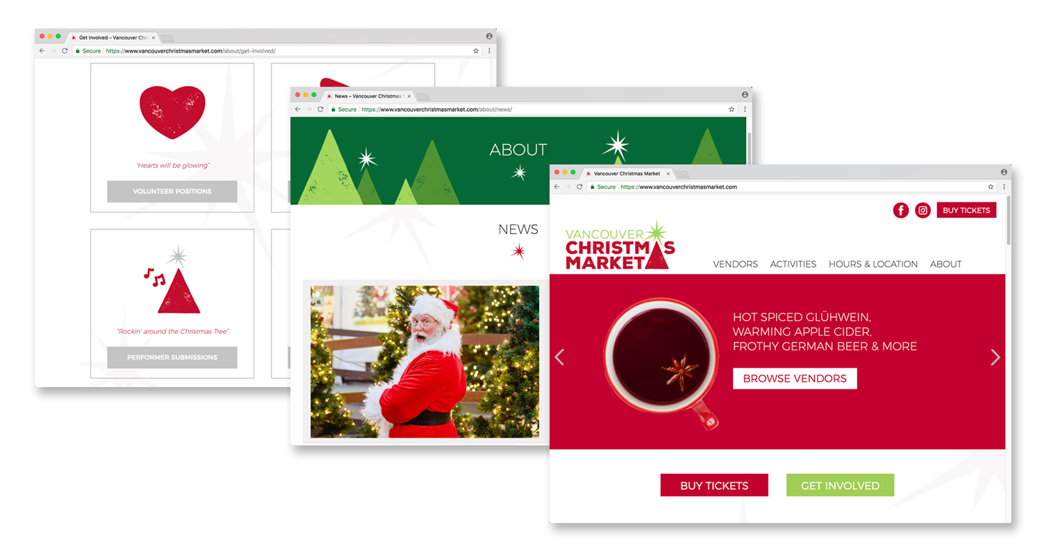
This was not a stand-alone logo design, but a full brand update to be implemented throughout on-site and promotional materials, corresponding with the launch of an entirely new website. The logo was designed with the possibilities of the larger brand in mind, ensuring that the logo itself, as well as fonts and graphic elements, could be easily repurposed to create a striking, festive and cohesive visual identity.
OPTIONS + OUTCOME
The initial options showcased a range of directions and solutions, but featured some consistent approaches that addressed our priorities and challenges.
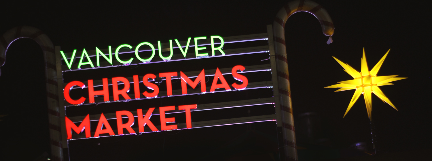
The Christmas tree is a simple and clear symbol for the holidays and remained at the heart of the logo. The goal was to simplify that element, rather than replace it. The font options remained very similar, in large part because the existing wordmark had become extremely recognizable, even iconic, due to its placement on the large lit sign welcoming people to the market each year.
The star element from the original logo remained a key feature in each option, as it communicates the twinkle of the market, represents the traditional Herrnhut stars that are a staple visual on-site and is a versatile graphic element that can be applied throughout the brand.
The existing deep red and bright green achieved the desired balance of festive and modern, so we focused on highlighting and celebrating these colours, adjusting the secondary colours to help the overall brand feel fresh and bold.

The final selected logo is simple and modern, yet festive and charming. The tree with its glimmering star symbolizes holiday cheer, even if in it’s most basic form. The texture on the shapes and on the bold, sans-serif font adds warmth and helps avoid a more corporate aesthetic.

In the new logo, the Christmas tree symbol and wordmark are heavily integrated to allow the words themselves to occupy maximum space, making it functional at any size.
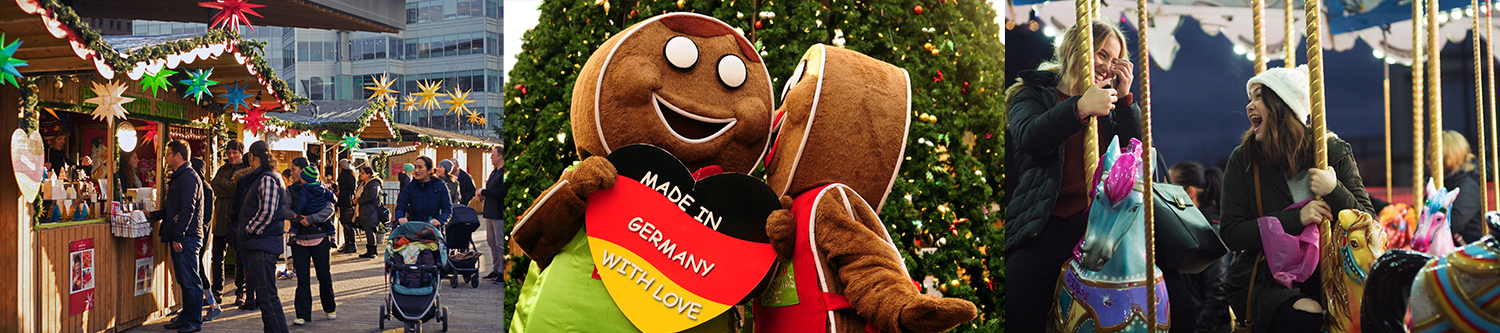
The clean design elements and strong colour palette function well within the logo, and can also be extracted and used to create cohesion throughout the brand. Paired with eye-catching images that speak to the experience of attending the market, this logo informed a clear visual identity, which guided the design of all new promotional materials, including a brand new website.
The spirit of the original logo remains and the brand is recognizable, but the result is both more striking and more versatile.